Maiden Medicine
balance and rhythm
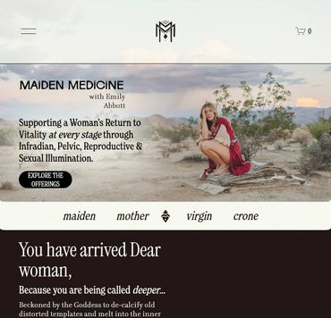
Logo design for Emily Abbot, a pelvic health and spirituality coach. The client and art director were inspired by Berber/Amazigh patterns, and asked for symmetrical concepts, to convey a balanced and sacred feel.
Art direction, wordmark, and website by Hannah Tindall.
Desert sunset photo by Kent Tupas on Unsplash
logos
Finding true north
The double-m monogram logo incorporates Amazigh iconography. The Ms intersect to create a pattern, and the diamond is a subtle reference to the yoni or womb. The second mark is simpler, and works well as a stamp, seal, and favicon.
applications
See more projects
This website uses cookies.
We use cookies to analyze website traffic and optimize your website experience. By accepting our use of cookies, your data will be aggregated with all other user data.