Infinite Music
Inspiring kids for life
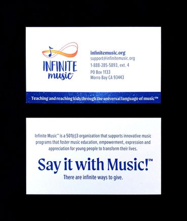
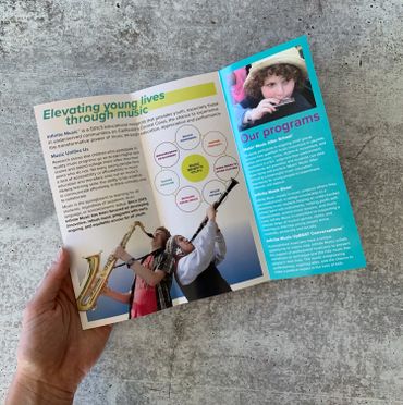
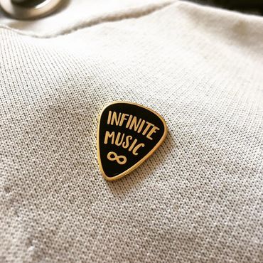
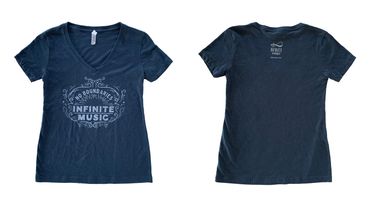
Logo, website, merchandise, brochure, and other projects for local music education nonprofit.
The client wanted to strike a balance between playful and respectable, so that the identity would appeal to parents, kids, and donors. The grassroots origins of the organization were also important, so they needed to avoid anything too corporate-looking.
For the logo, we combined the literal symbols for music and infinity (suggesting a musical staff), and paired them with the playful Garden Grown typefaces by Cultivated Mind.

Back to basics
Per the client’s request, I built the responsive website with GoDaddy Website Builder, so they can maintain and update it themselves. It’s fully responsive and works well on both desktop and mobile.
This was a great opportunity to feature tons of photos of all the students IM has provided lessons and/or instruments for. I kept the layout clean and simple, featuring the brand’s signature bright blue color on buttons and other accents, to really let the photographs shine.
website


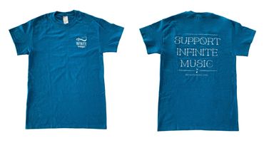
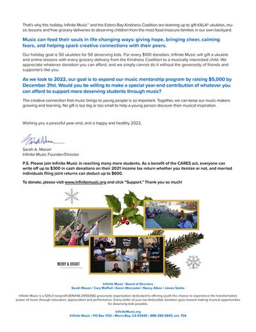
identity, brochure, merchandise, additional graphics



A musical family
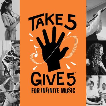
Logos for Infinite Music’s four main programs, each with a different educational focus. The logos needed to fit within the existing IM brand while communicating their own fun, exciting voices. Like the main logo, these needed to appeal equally to parents, students, and supporters.
Bright colors, bold type, and cut paper shapes hit the perfect chord.
program identities
.jpg/:/cr=t:0%25,l:0%25,w:100%25,h:100%25/rs=w:370,cg:true)
.jpg/:/cr=t:0%25,l:0%25,w:100%25,h:100%25/rs=w:370,cg:true)
.jpg/:/cr=t:0%25,l:0%25,w:100%25,h:100%25/rs=w:370,cg:true)
See more projects
This website uses cookies.
We use cookies to analyze website traffic and optimize your website experience. By accepting our use of cookies, your data will be aggregated with all other user data.